Most Innovative Meetings 2017: #4 Google I/O
Oct 31, 2017
By Mitra Sorrells
Attendee feedback drove a new design for the developer conference.
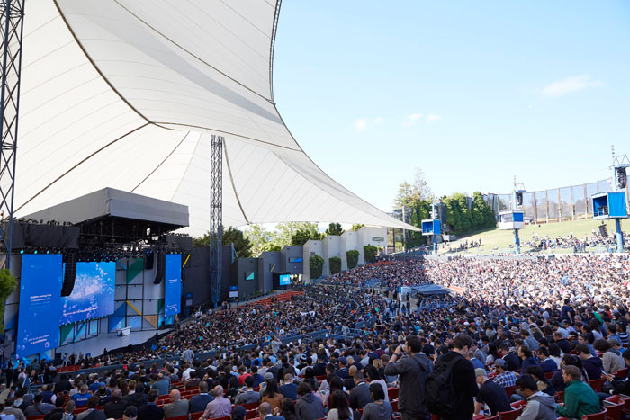
In 2016, Google completely redesigned its I/O developer conference, shifting from a fairly traditional format at San Francisco’s Moscone Center—where it had met for seven years—to a fun and funky festival setup at Shoreline Amphitheatre in Mountain View.
But rather than feeling compelled to stick with that new design, organizers once again gave the event a face-lift in 2017, with marked changes to the design, layout, and attendee experience at the Shoreline Amphitheatre in May.
“One of the core tenets of Google’s DNA is ‘focus on the user and all else will follow,’” said Amanda Matuk, executive producer of Google I/O. “After listening to the feedback from 2016, we knew the only way to continue to wow our audience, the only way to continue to build this community with them, was to listen to what they are saying.”
The festival-inspired design, while lively and eye-catching, was a bit too chaotic for some attendees and made it difficult to find sessions and food. So for 2017, organizers switched to a city-planning approach anchored by a “Main Street” that ran through the middle of the amphitheater’s parking lot, with four color-coded zones extending from it.
“All the breakout sessions and sandboxes had their doors faced into Main Street,” Matuk said. “It was the main drag, a shaded space we used not just for walking, but we had pop-up carts with food, picnic tables for people to relax, we had Legos and games.”
To aid in navigation, every corner had directional signs, session tents were labeled with large numbers, and several 8- by 8-foot “You Are Here”-style maps helped the nearly 10,000 developers, partners, and Google staff find their way around. Matuk said planners took the idea of “focusing on the user” one step further by handing out curated maps of suggested sessions for attendees based on specific product platforms and topics.
“Even though we have an app and the map was in that app, and all the information you could ever want is there, we still found people want some of these analog elements to persist,” she said.
Some of the new elements developed out of observations from event staff. Long lines outside sessions in 2016 prompted them to create a pre-registration system for this year. Attendees could use the mobile app to register for sessions in advance, which allowed them to enter through a Disney-style “Fast Pass” lane when the session opened, while organizers held about 20 percent of the seats in every session for walk-ins. Matuk said the system was a dramatic improvement and kept most wait times to less than five minutes.
Food service was another area where organizers made changes to improve efficiency. In 2016 there were 15 stations spread around the venue where attendees could grab breakfast or lunch. But, Matuk said, the numerous choices created confusion and resulted in long lines at some of the stations. For 2017, organizers located all meals in one site and positioned staff with color-coded menu signs that corresponded to the colors on the boxed food.
“For example, you’d know as you walk up that the blue box was roast beef and you could grab it without significant delay,” she said. “Lunch on the first day is the busiest. We had about 9,000 people this year, and we got through meal service in 45 minutes, which is amazing.”
Conference partners included Sparks, Level 2 Design, Creative Technology, and Global Gourmet.
 Read On BizBash